Radial Menu
The radial menu is closed by default. It opens while a hold key is pressed, anchors at the mouse position where it opened, highlights the option in the mouse direction, and selects the highlighted option when the key is released. It uses Unity’s built-in input APIs directly, so no custom input asset is required for the default keyboard/mouse path.
Preview
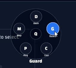
Basic Setup
Create one LuiRadialMenuState field and one item list. Keep the state as a field so it survives
between renders.
private readonly LuiRadialMenuState _radial = new(KeyCode.Q);
private readonly LuiSignal<string> _selected = new("None");

private readonly LuiRadialMenuItem[] _items =
{
    new("dash", "Dash", dashIcon),
    new("guard", "Guard", guardIcon),
    new("cast", "Cast", castIcon),
    new("ping", "Ping")
};
Call Update from the component’s Update() method. The callback receives the selected item id
when the hold key is released over a valid option.
private void Update()
{
    _radial.Update(this, _items, id => _selected.Value = id);
}
Render the menu anywhere in your node tree. It portals itself to the overlay layer while open, so it is not clipped by surrounding layout or scroll containers.
public override LuiNode Render()
{
    return Lui.Div("w-screen h-screen",
        Lui.Text($"Selected: {_selected.Value}"),
        Lui.RadialMenu(_radial, _items)
    );
}
Customize Input
Set the hold key in the constructor or by assigning HoldKey.
private readonly LuiRadialMenuState _radial = new(KeyCode.LeftAlt);

private void Awake()
{
    _radial.HoldKey = KeyCode.E;
}
Useful state settings:
HoldKey- key or mouse button that opens the menu while held.DeadZone- mouse distance from the open point before an item highlights.StartAngle- angle for the first item. The default is-90, which starts at the top.
_radial.DeadZone = 36f;
_radial.StartAngle = -90f;
Customize Size
Pass size values to Lui.RadialMenu.
Lui.RadialMenu(
    _radial,
    _items,
    size: 420f,
    radius: 150f,
itemSize: 92f)size- total diameter of the menu.radius- distance from the center to each item.itemSize- diameter of each item button.classes- extra utility classes for the menu root.
Add, Remove, or Disable Items
Items are simple data values: LuiRadialMenuItem(id, label, icon, disabled). Add or remove entries
from the array/list and the menu spaces them evenly around the circle.
private readonly List<LuiRadialMenuItem> _items = new()
{
    new LuiRadialMenuItem("dash", "Dash", dashIcon),
    new LuiRadialMenuItem("guard", "Guard", guardIcon),
    new LuiRadialMenuItem("cast", "Cast", castIcon),
    new LuiRadialMenuItem("map", "Map", mapIcon, disabled: true)
};
For dynamic menus, mutate the list and refresh the component.
_items.Add(new LuiRadialMenuItem("ping", "Ping", pingIcon));
Refresh();
Disabled items render dimmed and cannot be selected.